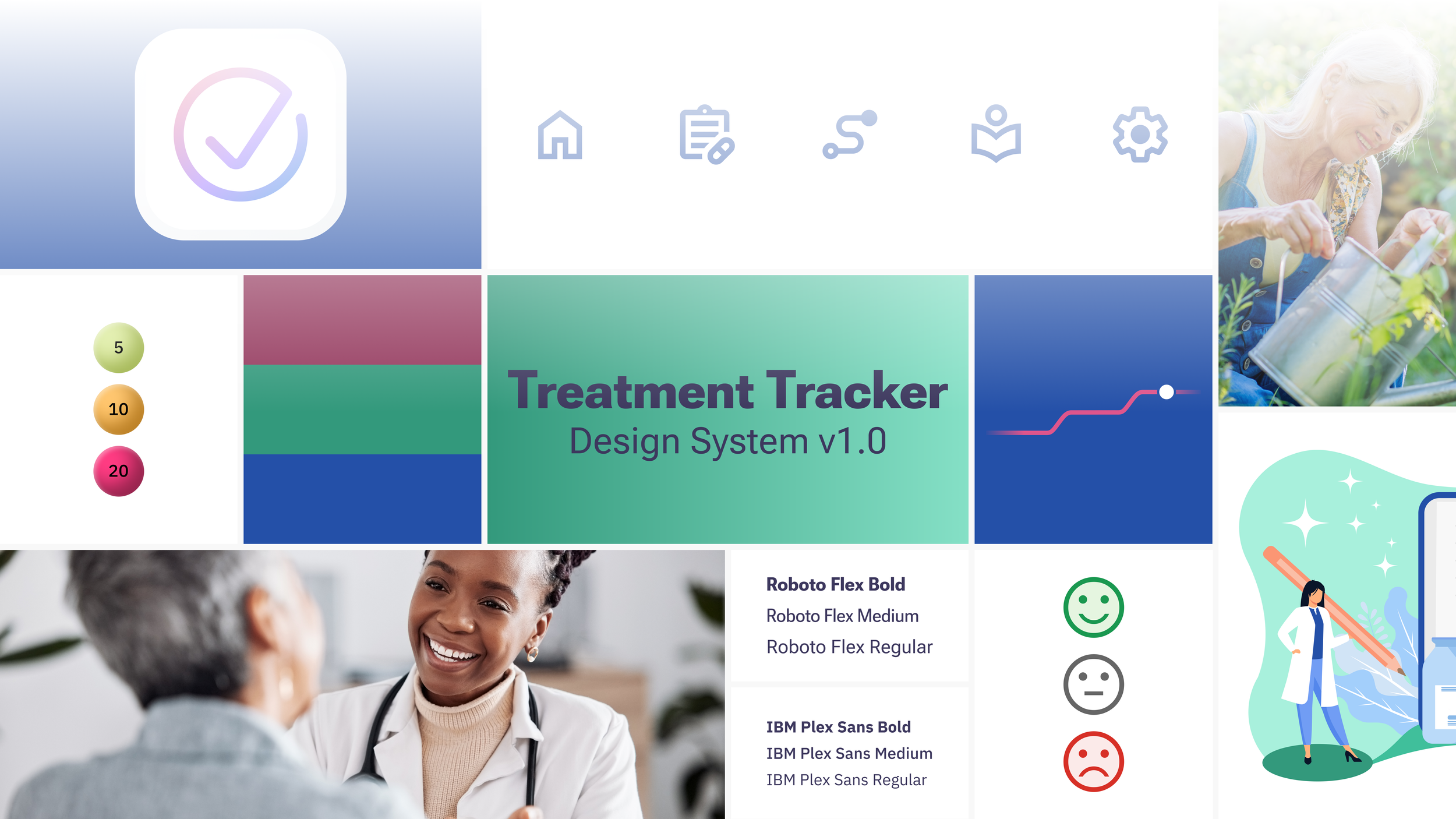
Creating a design system from scratch!
Establishing style guidelines and design rules for increased design efficiency and better development implementation
UX Team: Alec DeNapoli
Skills: UX/UI, design systems, prototyping, branding application, dev/QA collaboration
Starting a product from scratch was a great opportunity to set the foundation for future success with a design system/library. On previous projects, I had identified lots of style inconsistencies related to color, spacing and more that never seemed enough of a priority to address. On top of that, they were designed in Sketch which left something to be desired in terms of the component/style infrastructure.
The Treatment Tracker product was going to be the first my team created in Figma from day 1 and I knew I wanted to get some experience creating a foundational design system. Due to our tight timelines for the v1.0 of the app, I knew doing some upfront work to create a space for documenting all of our developing guidelines would help us design faster and make updates more efficiently moving forward.
The Challenges
1
Multiple designers were ideating on separate sections of the app simultaneously - leading to increased inconsistencies
2
Our dev team wanted to utilize as much ‘out of the box’ resources from Material Design 3 as possible for v1.0
3
I’d never created a design system before and didn’t know where to start!
The Approach
I spent a lot of time researching design systems online (specifically Material Design 3, which was still newly launched and not fully documented at the time). Trying to absorb as much information as possible, I quickly became overwhelmed. The floodgates were open and I was barely keeping my head above water sorting through all the different component guidelines while always trying to decipher the underlying logic behind the designs I was studying.
Luckily my team was given a basic/work-in-progress branding guide. This was created for a pharmaceutical website, not a mobile app, so it was a good start but needed much more detail to be of use. We had a few spot colors, some typefaces, and some icons/photos.
With the branding guide and my working knowledge of Material 3, I set off to find a way to marry the two systems so both the brand team and developers were happy.
The Treatment Tracker Design System v1.0
The Colors
This was by far the most complicated part of the system for me! Not only was it hard for me to understand how the Material 3 color generator worked (I spent so much time trying to reverse engineer it to create my own from scratch to allow for full customizability), but it took equally as long to teach my team how to use it properly!
Using Figma was super fun for this, learning how to use variables to tokenize all the colors and quickly switch between light and dark modes (which was an added bonus we didn’t think we’d have time for!)
Ultimately, since it was generated using Material 3 and then customized, its not perfect, but it set a great foundation for v1.0!


The Typescale
Fortunately, we started with two typefaces chosen for us which eliminated the need for us to spend what could have been years trying to pick them ourselves. However, there weren’t nearly enough styles defined in the branding guide so we still had some work to do. The typescale grew as needed throughout the entirety of the app design process. Through reviews with fellow designers and developers, this group of type styles was created to establish a logical hierarchy that allowed for a diverse array of contexts.

The Spacing
I’ve always been drawn to the simplicity of an 8pt baseline grid. It scratches an itch in my type-A brain that is so satisfying. Being able to have nice and even spacing intervals that scale well and easily reinforce visual hierarchy while not taking much mental effort - *chefs kiss*.
I loved when we finally settled on this format because it provided such logical guide-rails to our designs and made design reviews more efficient since we had fewer variables to experiment with once we were deep in the pixels of specific components.
