
Treatment Tracker
Providing a tool for patients treating their movement disorder to track their symptom progress and find their effective prescription dose along the way.
UX Team: Alec DeNapoli, Jenna-Leigh Meola, Chris McGillicuddy, Chandlyr Jackson
I was the lead designer on 3 of the 6 app sections (Home, Resources, and Adding Treatment Schedules). I also led the design system initiative (which can be seen in more detail separately)
Skills: UX/UI, research synthesis, concept generation, user flows, site mapping, sketching/wireframing, high-fidelity screen designs, design systems, prototyping, branding application, dev/QA collaboration
This project was an extremely fast paced project getting to MVP. It was a deeply rich experience creating a mobile app from scratch going from research and concepting through testing and validating a piece of software in production.
Due to the nature of the project and the need to protect the IP, many of the details/copy/assets/branding have been re-worked for the purposes of this portfolio.
The Challenges
1
Patients manage many medications daily and are wary of adding new treatments into their routine that may affect their stability
2
Patients struggle to communicate the social, emotional, and physical impact their uncontrolled movements have on their lives, often feeling unheard by their healthcare providers
3
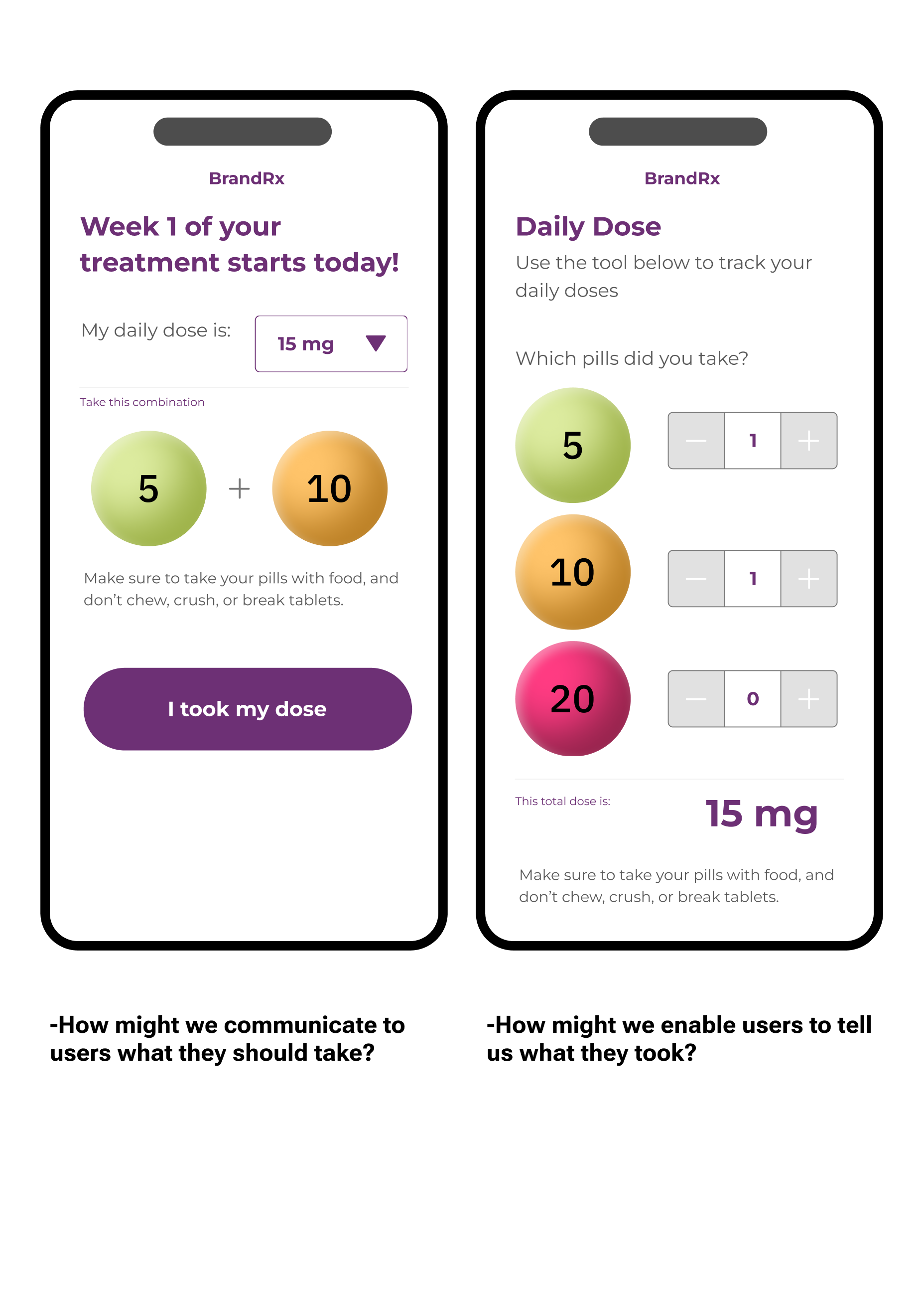
Patients often drop off treatment due to a difficulty in recognizing progress in their symptoms and the complexity of treatment: mixing and matching three different strengths of tablets in order to create each incremental dose on their journey to find the one that works best for them.
The User

How might we empower patients to take an active role in their treatment, enable them to find their effective dose, and mitigate stress?
The Approach
After synthesizing a large amount of marketing and ethnographic research that had been done around the patient experience for this treatment, we had to expand upon the jobs to be done. Our focus at the time included the patients, their caregivers who may be assisting with treatment, as well as the healthcare professionals treating them.
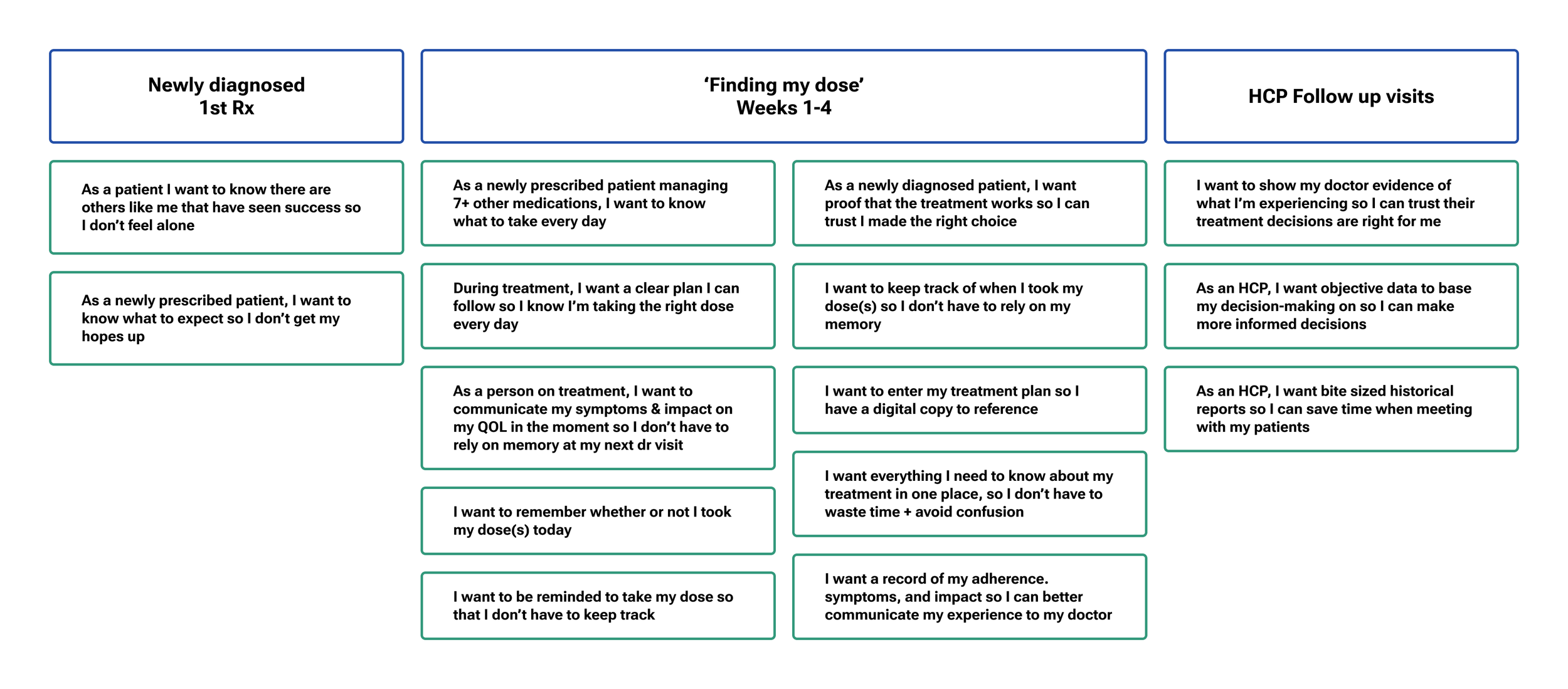
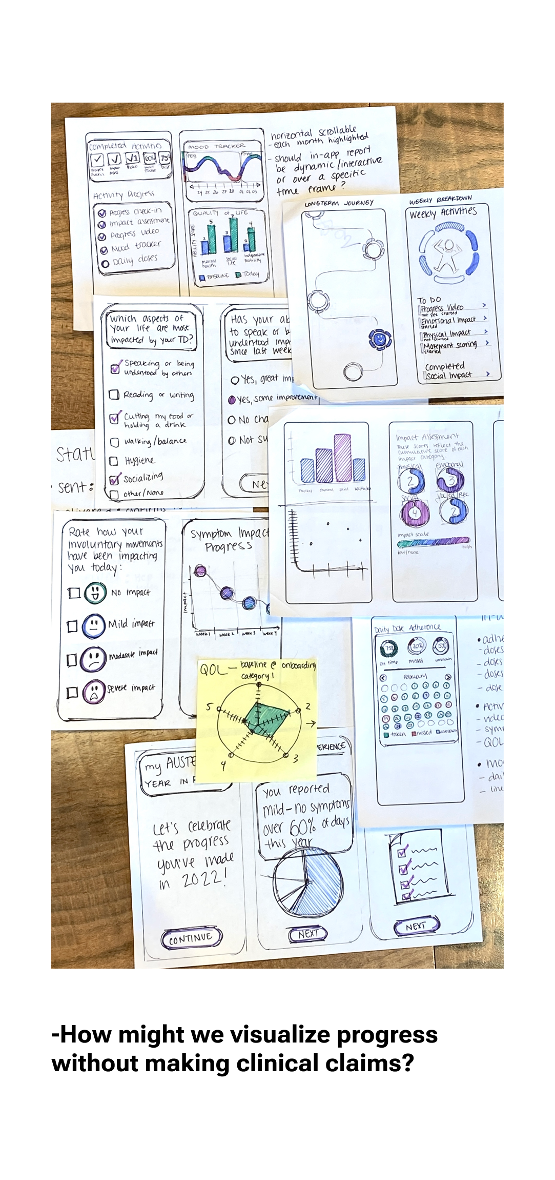
After utilizing the jobs to be done framework, we created ‘How might we…’ statements to start ideating on possible high-level problems to be solved. From messy sticky note sketches to low fidelity digital mockups, we answered the ‘how might we’s with conceptual solutions. We highlighted multiple solutions per 'HMW’ and made a point to identify any potential blockers/questions/concerns to bring up to relevant stakeholders.
This was a super exciting period of the project, turning a meeting space into a sticky-note-filled war room for two weeks in preparation for user interviews.

The Learnings
The concepts developed above were used as stimuli in user interviews to assess feasibility. There were 14 (60 minute) interviews with patients living with the target movement disorder and 20 (75 minute) interviews with healthcare professionals that interface with this patient demographic. The focus of the study was to determine the usefulness and usability of the app and HCP dashboard concepts, and gather contextual information regarding the treatment of the movement disorder, all to inform further design iterations and product decisions.

The Solution
We spent a lot of time figuring out how to structure the IA for the app. Medication information used to live in a version of a ‘profile,’ and ‘journey’ used to include treatment schedules, and resources used to be an additional card underneath the prescription details. As the complexity grew, features spread out more and were fleshed out in their own dedicated space.

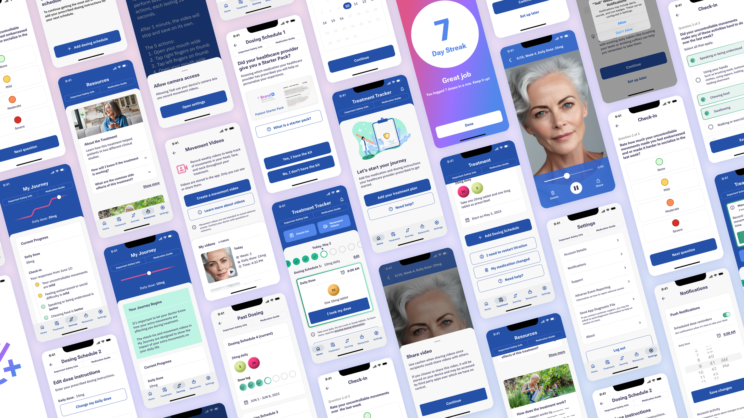
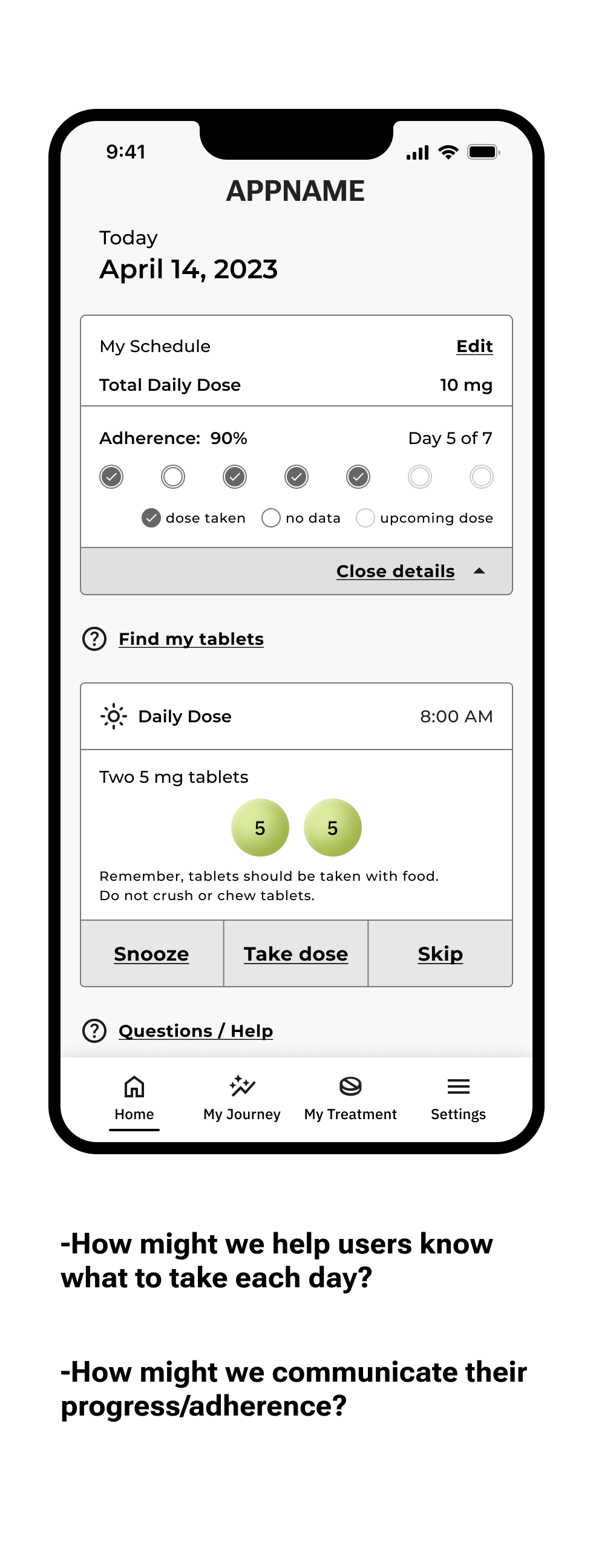
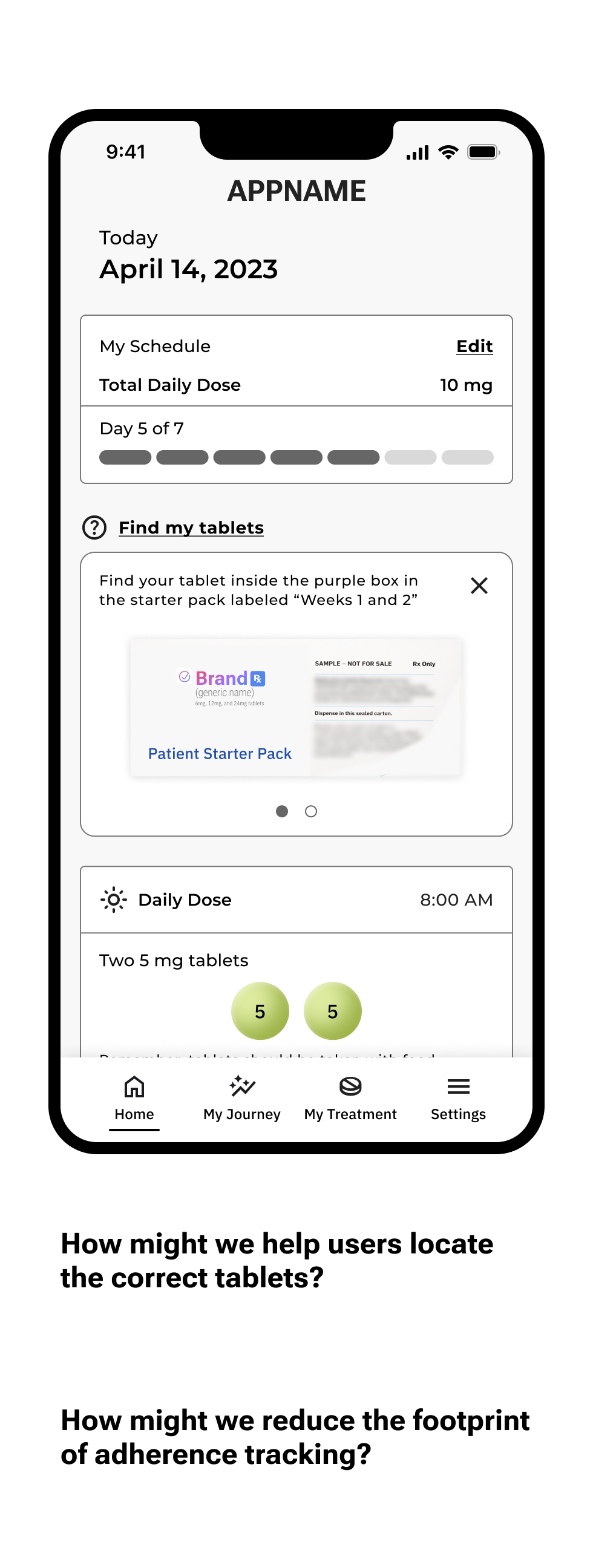
HOME
Log doses, view medication details, keep track of adherence, jump to other sections of the app, view and manage notifications for progress tracking.
I was the lead designer on this section of the app.

Notifications (in-app): Receive reminders for weekly progress tracking activities, and other helpful tips.

First use: Upon entering the app for the first time, users are able to explore but directed to add their treatment information to start using the app

Process highlights
The design challenge for this section was a constant balancing act of information priority. There is a lot of information to communicate: adherence progress, today’s tablets, the current active schedule, FAQ’s and additional progress activity links, as well as links to be able to dive deeper to review or edit the information.
As the overall app architecture changed, so did the organization of content on Home. For any given component on the screen, there were dozens of iterations. A high level ‘highlight reel’ of the process is shown below.


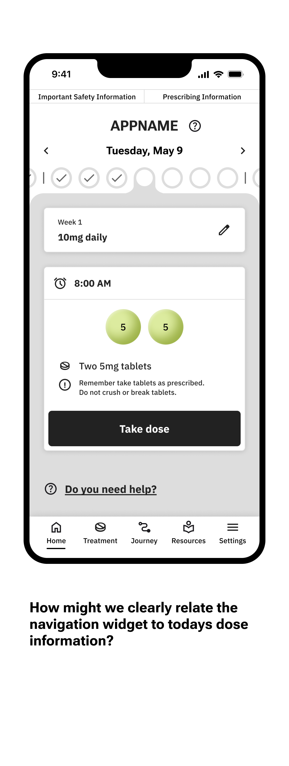


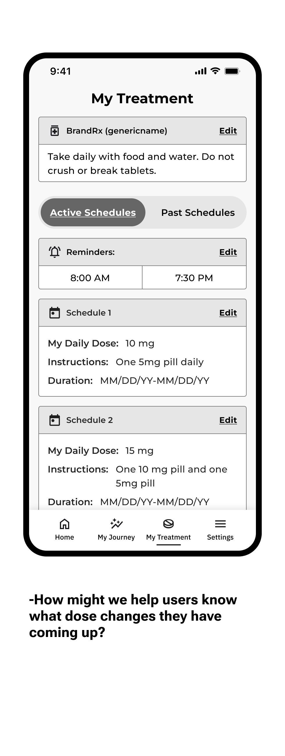
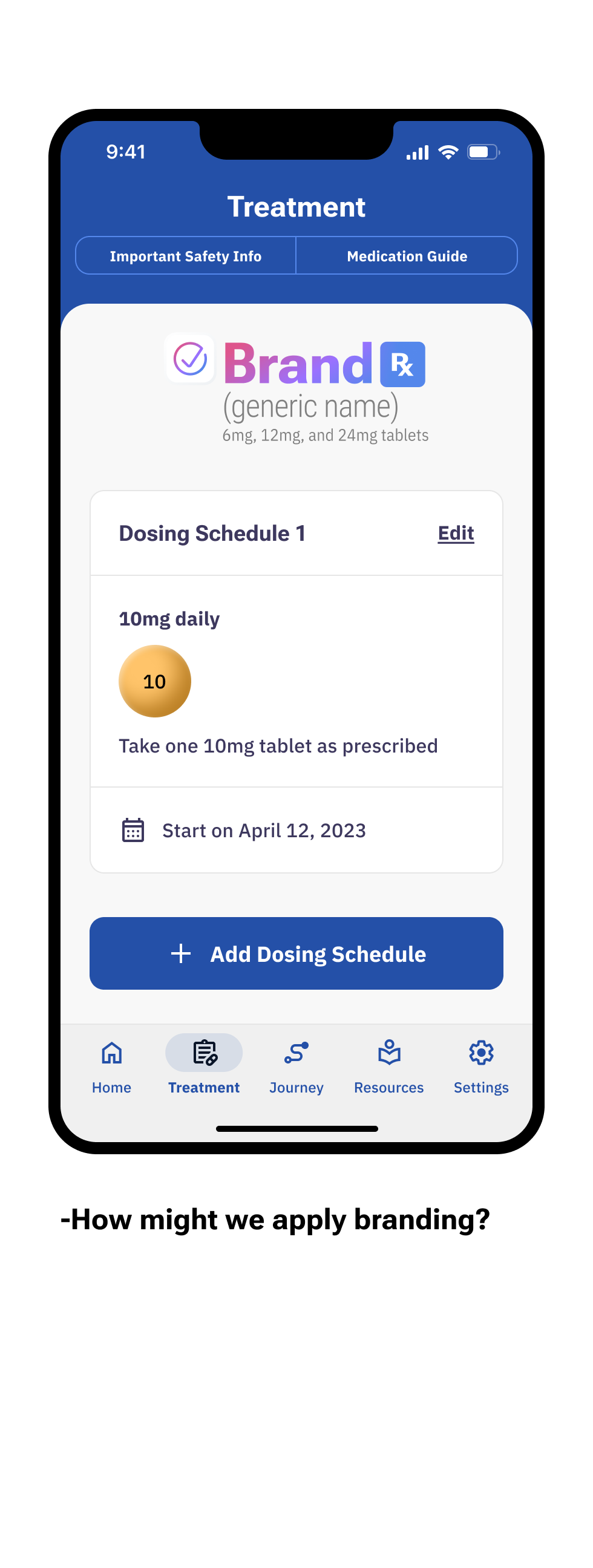
Treatment
Manage your treatment information by creating and editing your titration schedules, also view current and upcoming treatment information to know what to expect throughout treatment.
I lead the design of adding dosing schedules/inputting treatment details.


Adding dosing schedules: Enter weekly dose, tablet combination, and start date for each dose change throughout treatment.
Process highlights
Over the course of the project, we discussed different ways to organize all the content we wanted to include. There are the treatment schedules and tasks related to creating/editing them as well as medically relevant background/safety information on the medication we needed to include. As the project scope grew, we decided to keep the schedules in a dedicated treatment page and move the regulatory documents accessible in the screen header as well as the settings tab.
Each section used to be editable (medication type, reminders, schedules) and later became consolidated and accessible through one edit link associated with each schedule. The screen concepts started very dense and grew to include breathing room for all the details. This helps to clearly communicate and prevent the user getting overwhelmed.


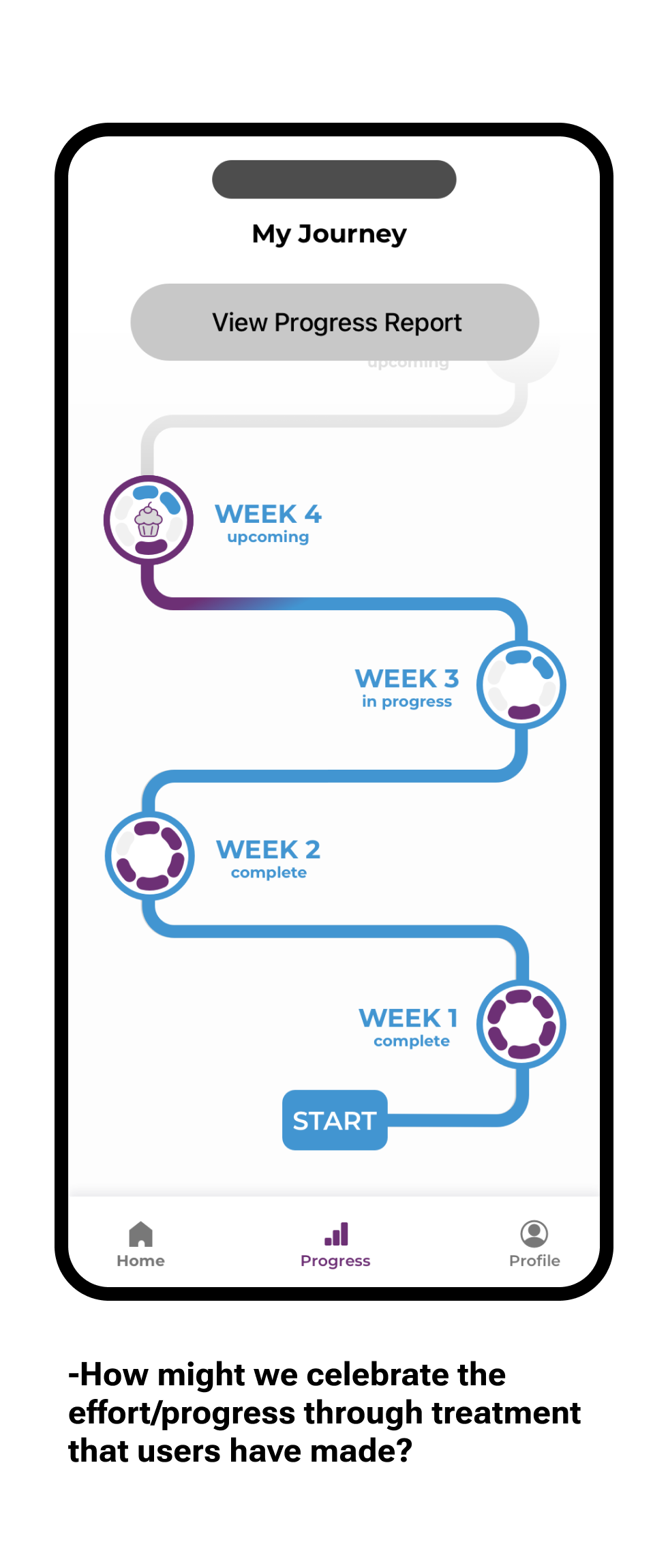
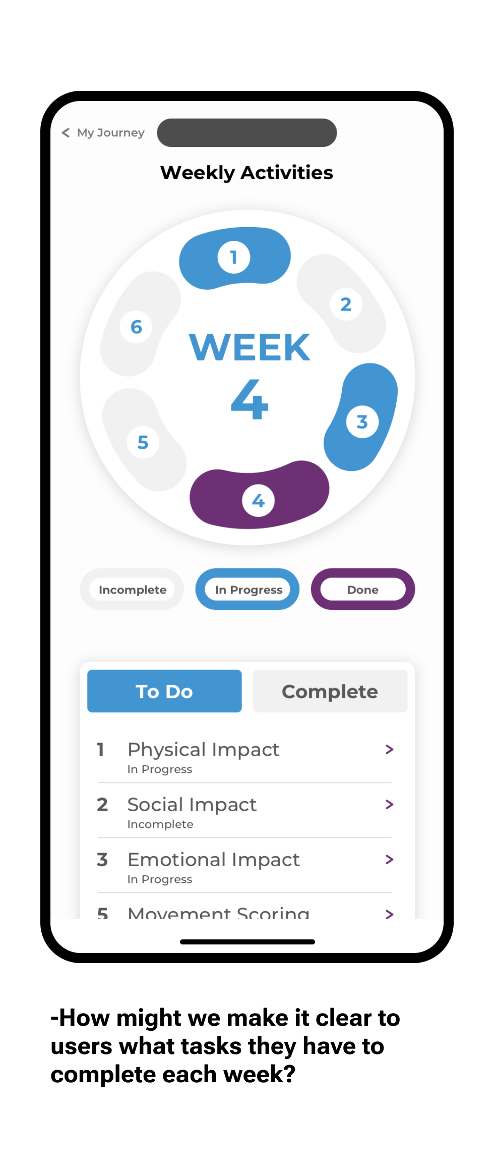
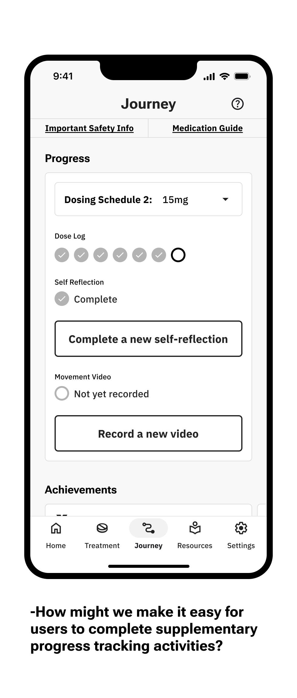
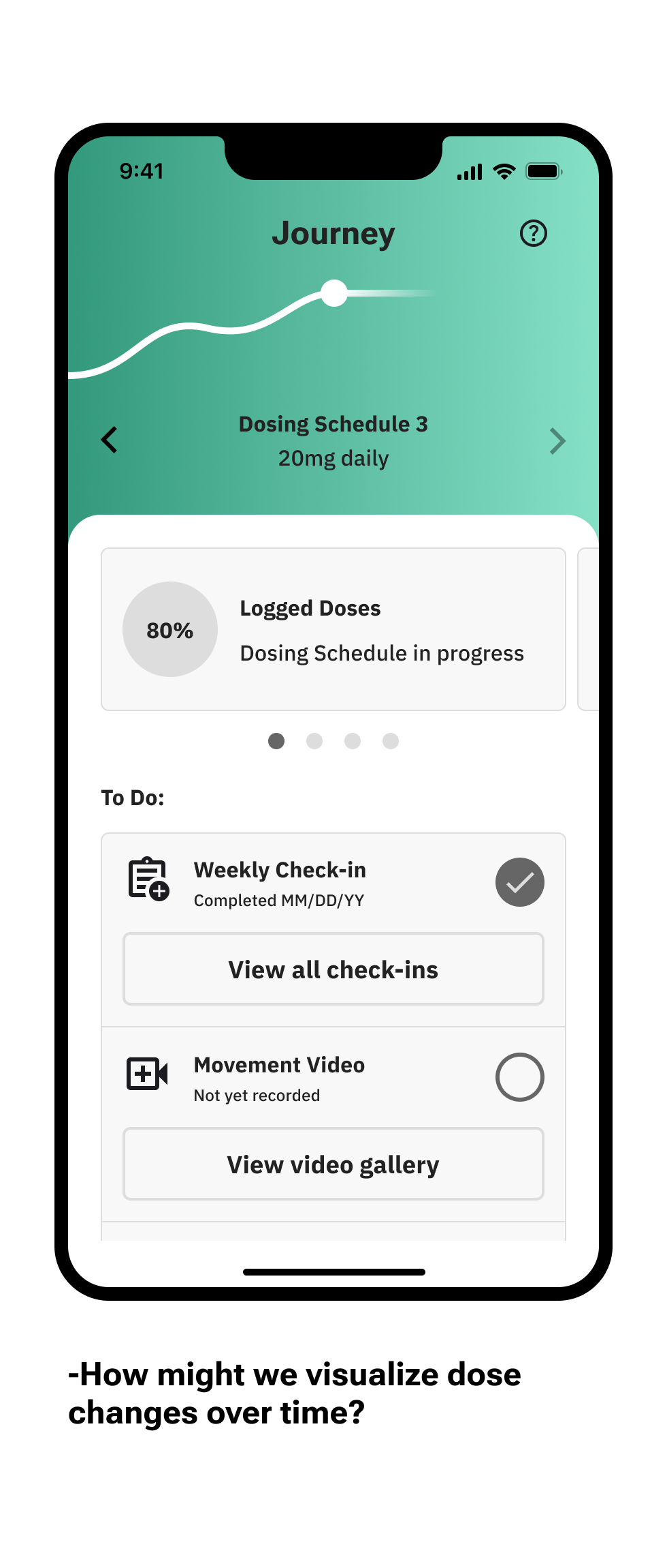
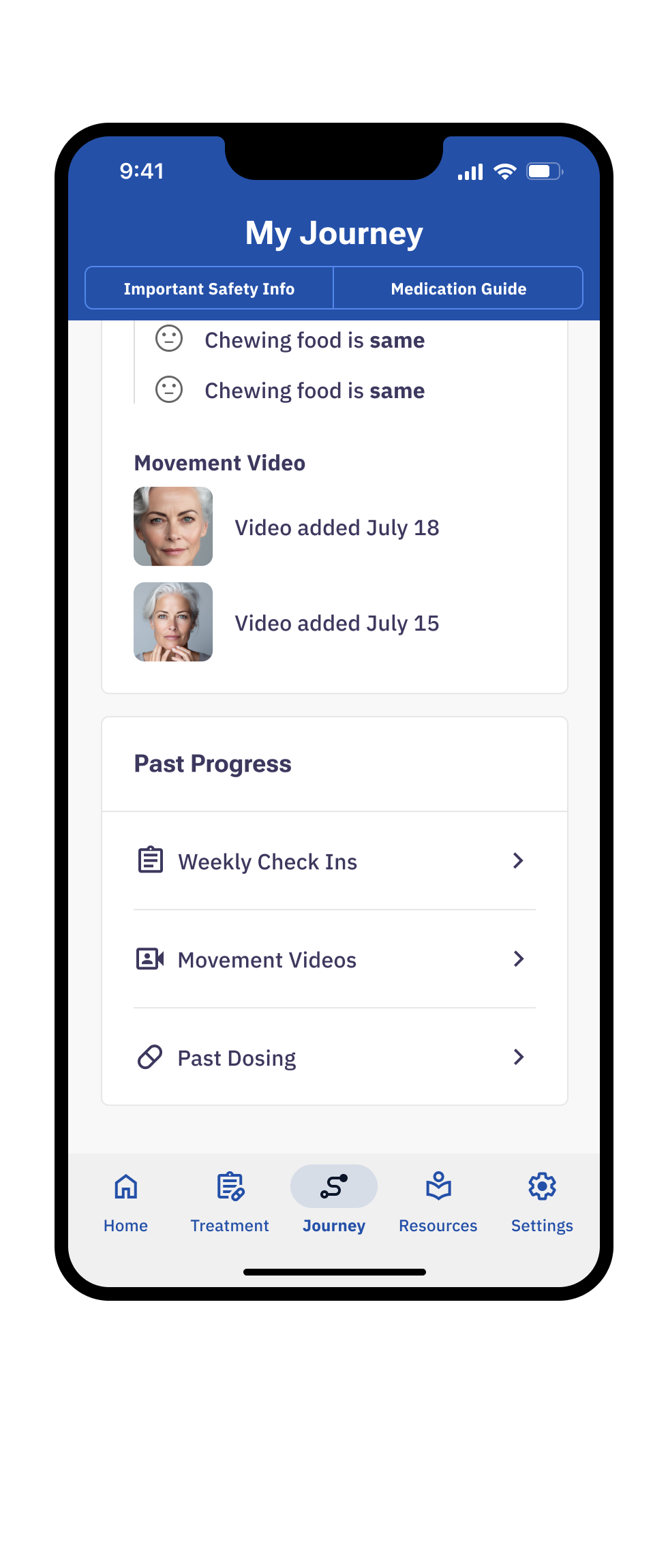
Journey
Complete progress tracking activities like weekly check-ins and movement videos, as well as review treatment progress and history.
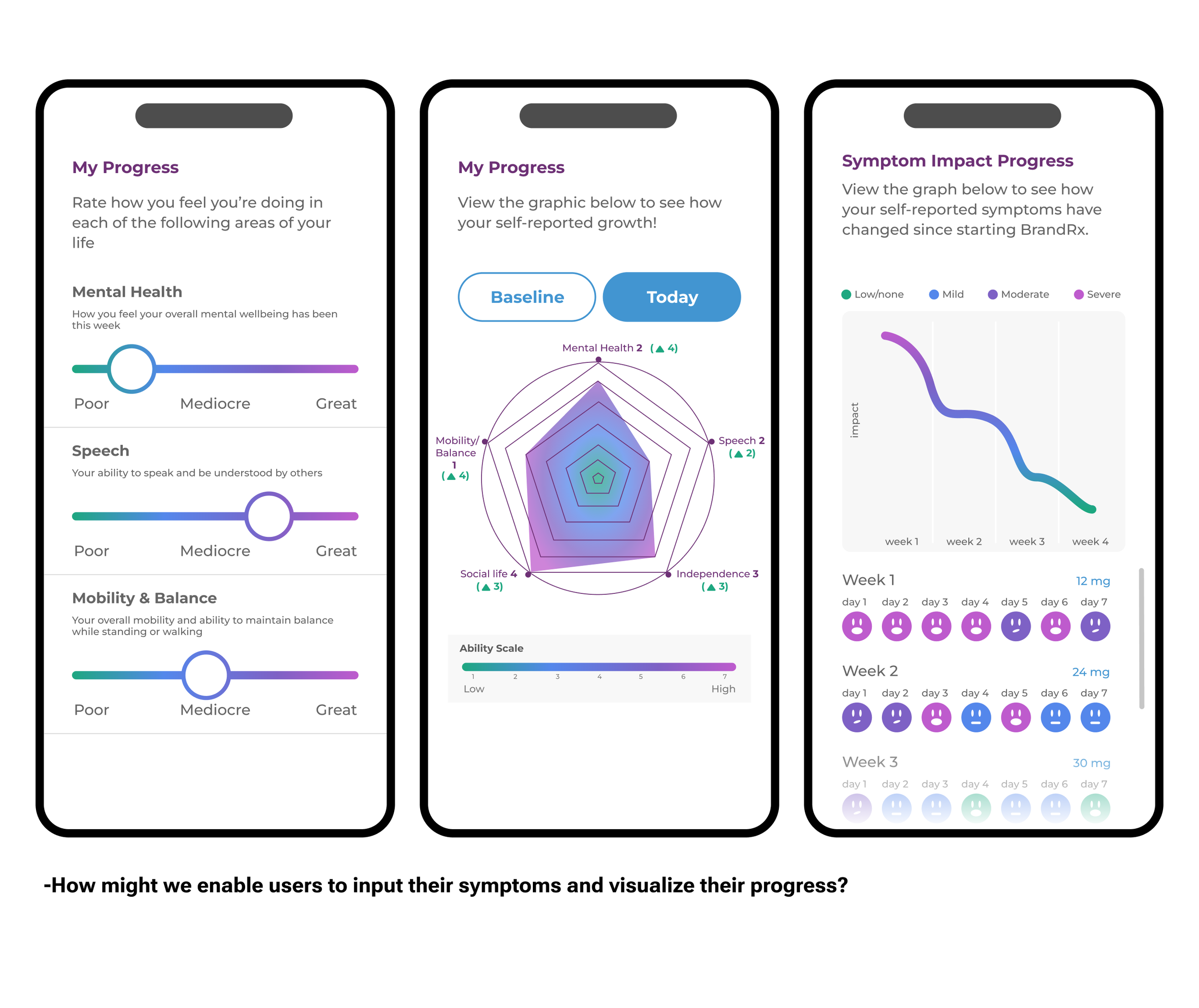
I contributed to user flows, user interview stimuli, mid-to-high fidelity mockups, and the dynamic dose-change line graph visualization.


Past Progress: Historical views of completed tasks (check-ins, recorded movement videos, and doses logged)

Weekly Check-ins: Rate the intensity of your involuntary movements, where they are occurring, and the impact they have on your life.

Movement Videos: Record an AIMS (abnormal involuntary movement scale) style video to have a record of your symptoms to show your healthcare provider.
Process highlights
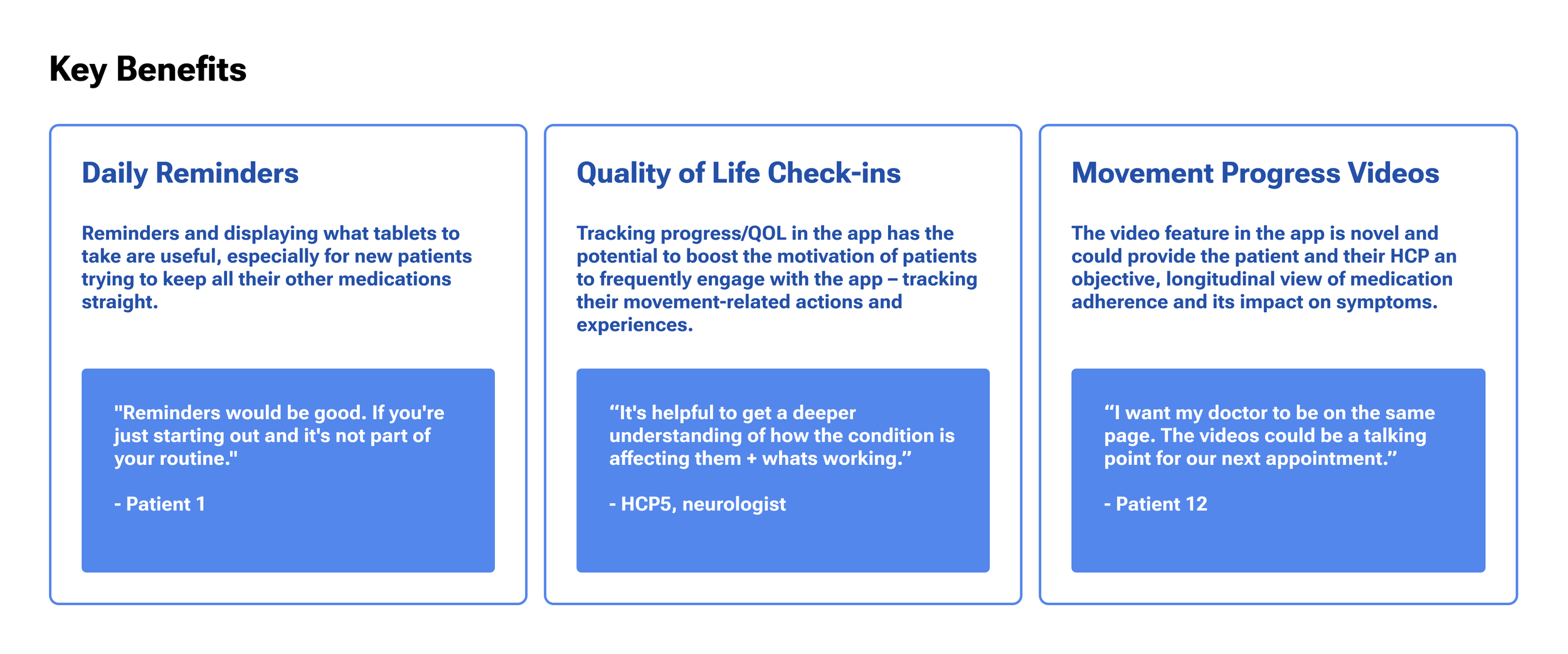
The goal for ‘My Journey’ was always to create an area of motivational reflection. We wanted to communicate the users’ progress through their treatment and keep them accountable to themselves to keep tracking their symptoms. We played around with various ways of displaying achievements and milestones and due to business and regulatory constraintsultimately landed on an elegant line graph that displays their change in dose over time.


RESOURCES
Learn more about how the treatment works, how to use the app, when to expect to see progress, and connect with outside resources and organizations.
I was the lead designer on this section of the app.
